Color Trend: Coral
Pantone may have declared coral the color of the year back in 2019, but my Instagram feed has been full of dusty coral and salmon hues lately. I’ve always loved using color in designs, and these warm, soft shades feel just right as we head into the warmer spring days.
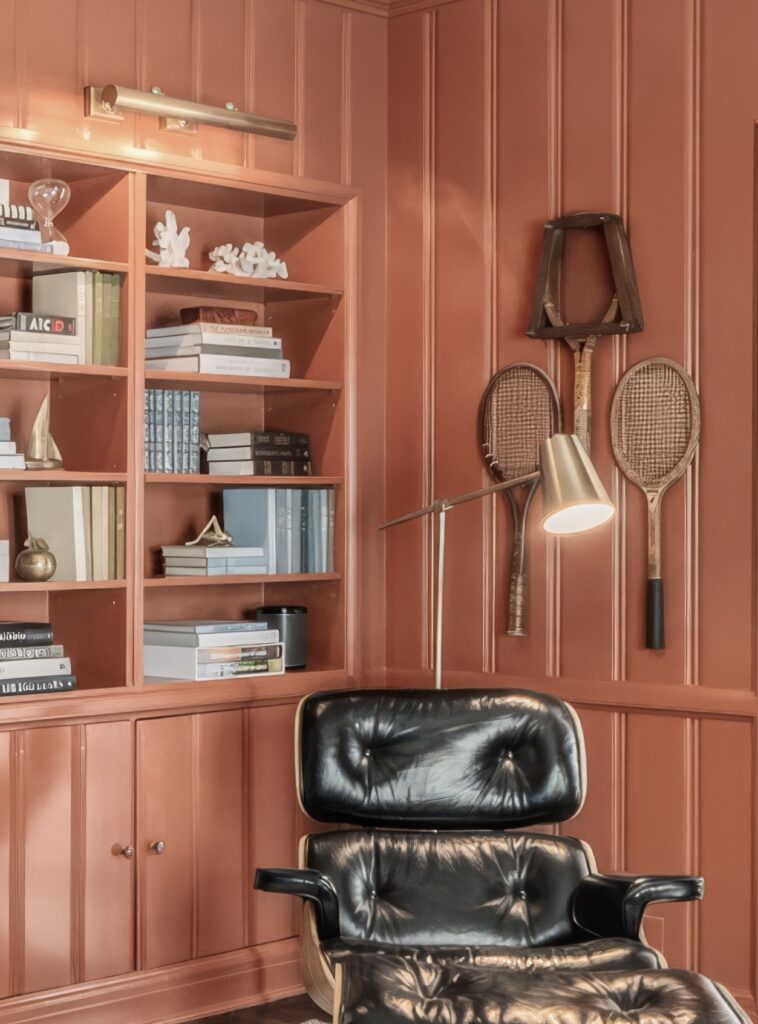
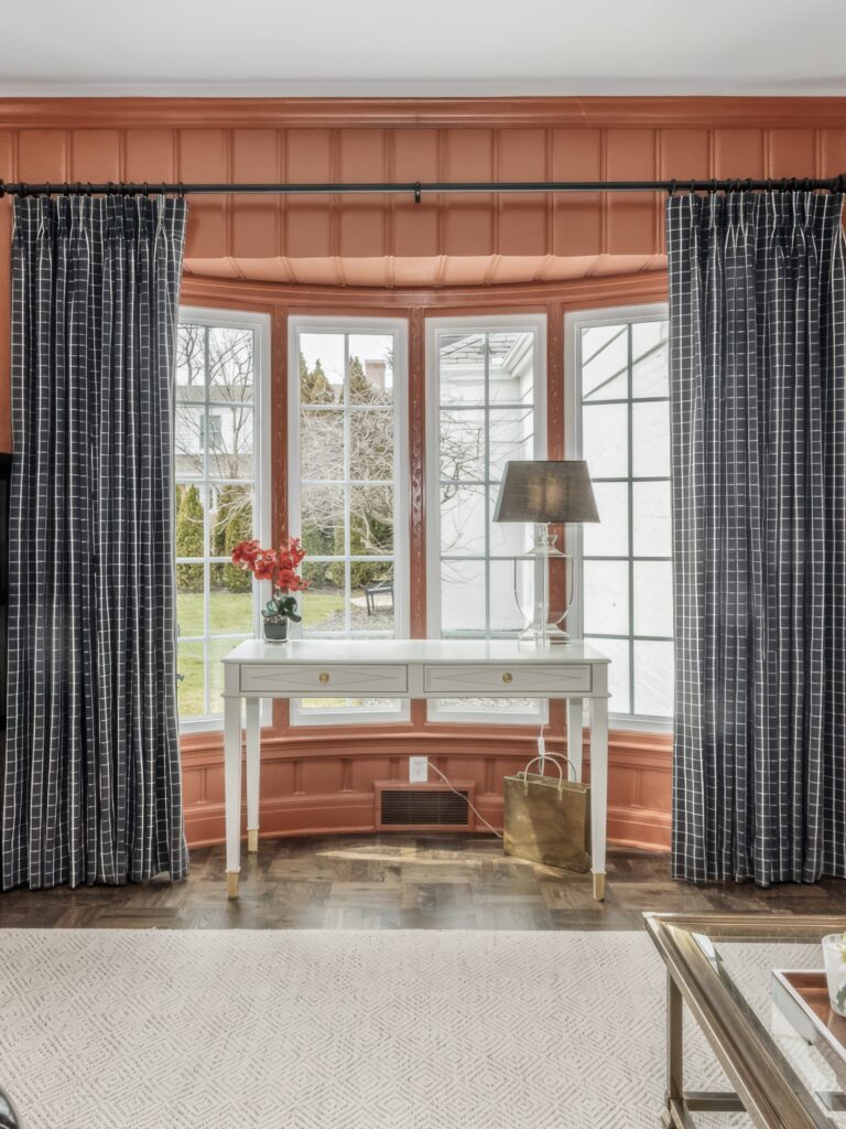
We chose a moody coral for the library in our Bold Historic Home project, color-drenching the entire room. This room didn’t have much natural light, so we embraced the cocoon-like feel and wrapped the room in this deep burnt orange color. It created a cozy yet sophisticated vibe – perfect for curling up with a good book or enjoying an evening cocktail with friends.

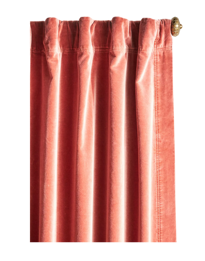
We paired the bold coral with lots of contrasting elements like the charcoal velvet sofa and checkered drapery to help punctuate the colorful walls and carry your eye around the room. The neutral wool rug and lighter accents soften the space and keep the coral from overwhelming. I particularly love all the hints of brass that really help the room glow at night.
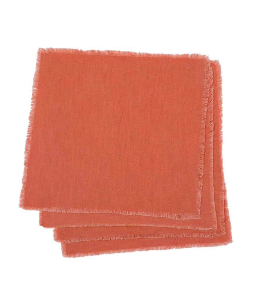
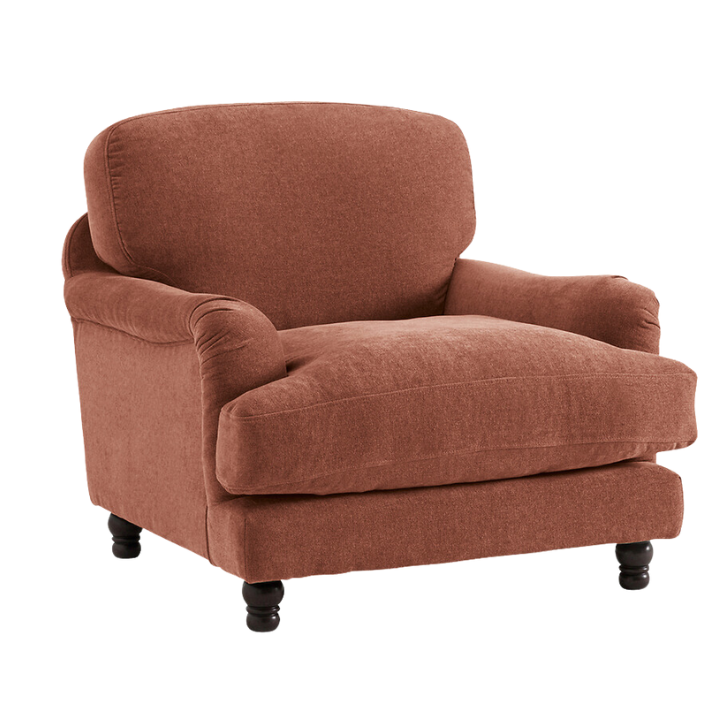
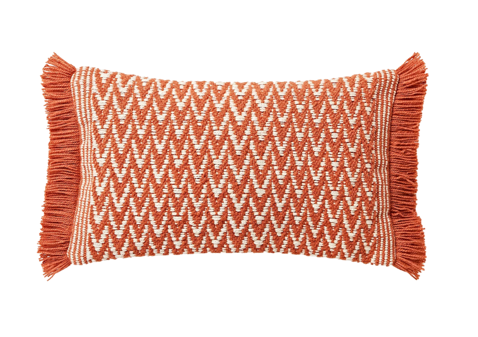
If you’re ready to embrace coral in your space, make sure to balance it with calming neutrals like gray, white or beige. It also works well with other muted tones like dusty blue, moss green, or dark brown. You can be adventurous and use it as a primary color for walls like we did, or start with smaller details like pillows, curtains or artwork. Coral can also be used in different textures, like velvet, linen, or patterned fabrics, to add depth and visual interest.
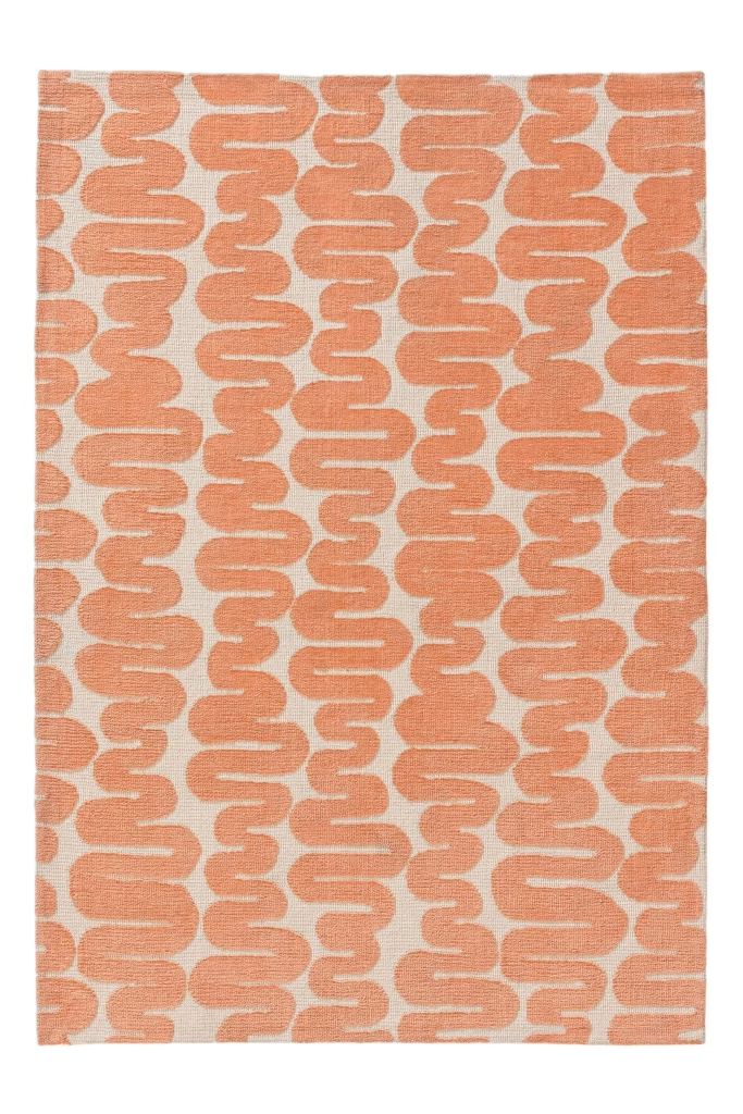
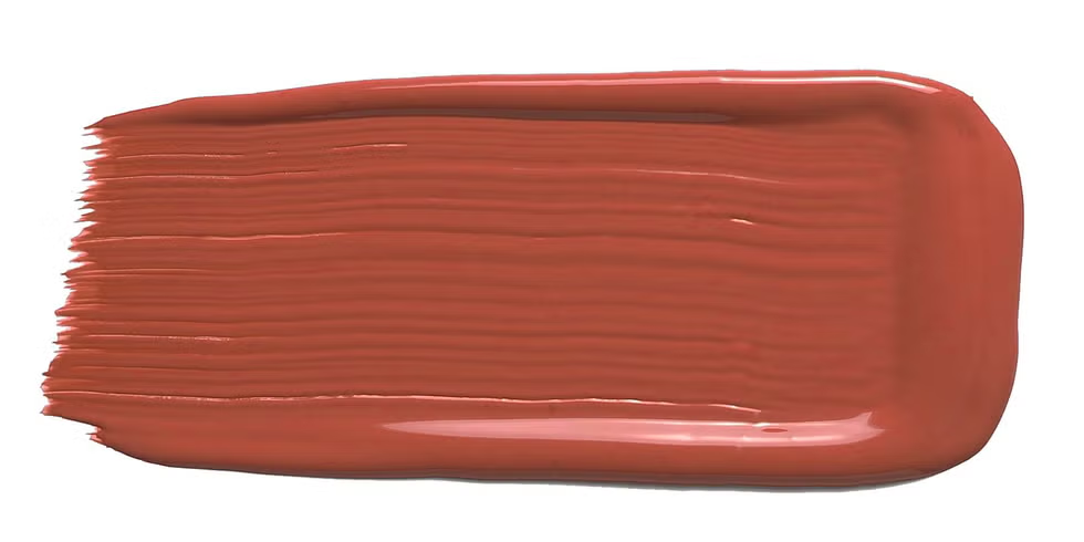
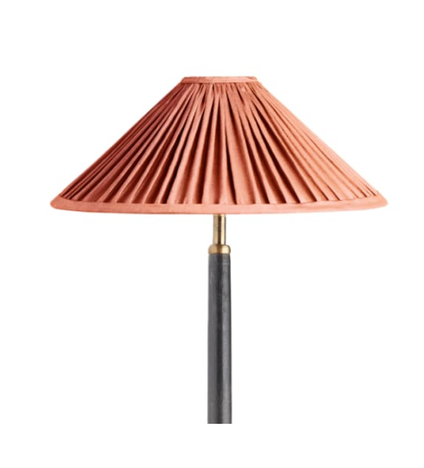
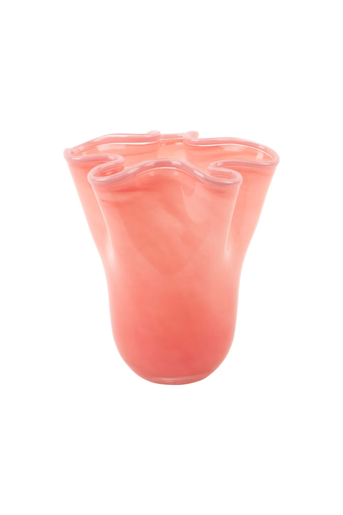
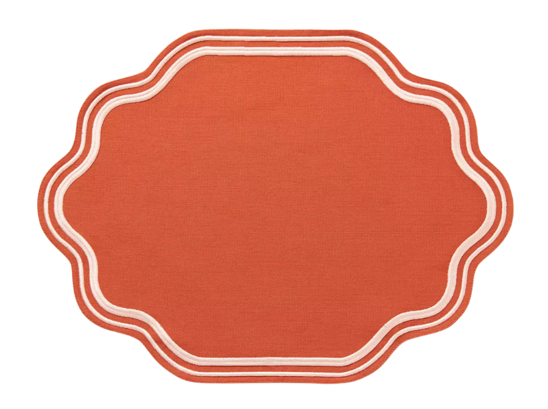
There are tons of ways to bring this bold hue into your home – from tableware to furniture to decor accessories. Here are some of my favorite finds!